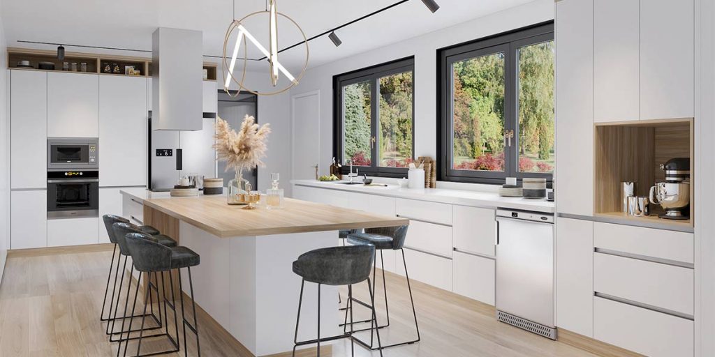
A spacious kitchen with sky-high ceilings and ample natural light is the absolute dream. However, most of us have to make do with awkward layouts and less-than-ideal storage space. But a small kitchen doesn’t have to be so bad. In fact, with the right small-space solutions and functional design ideas, it won’t matter what square footage you’re working with. Ahead, we’ve rounded up more than 80 clever and chic small kitchen ideas to pull inspiration from so that you never feel like a claustrophobic cook again. We promise these tricks will help you make the most of your counter space and cabinetry—and they might even make you want to spend even more time in your kitchen.
1 STREAMLINE THE SPACE
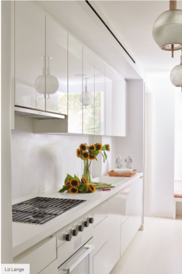
Opting for an all-white kitchen can instantly make a space feel bigger thanks to the shade’s light-reflecting nature. Smooth, glossy cabinet fronts (no hardware here) and a cooktop set in matching countertops maximizes the gleaming effect.
2 MAKE YOUR OWN ISLAND
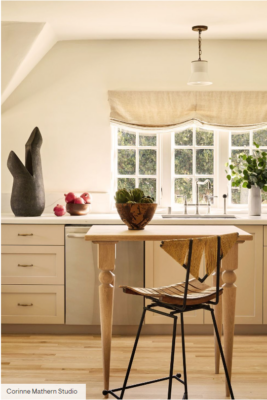
In this small kitchen by designer Corinne Mathern Studio, a counter-height work table doubles as an island and eating space. You can easily push a piece like this against the wall or move it out of the room anytime it starts to feel cramped.
3 PAINT EACH PORTION
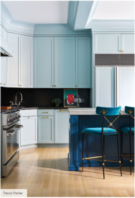
Here’s a playful way to designate a kitchen’s different zones and make it appear bigger: Use three blue shades to create depth, as designer Garrow Kedigian did here. Stretching the lightest one up to the ceiling emphasizes its height, making this space feel airy.
4 LIGHTEN UP
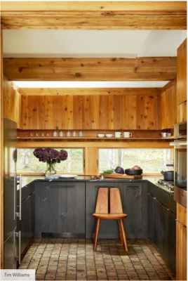
To ground a small kitchen without making it feel cave-like, use a dark color on only the bottom half, and swap for a lighter shade on top. Natural wood connects this space to the forest outside.
5 PAINT THE FLOOR
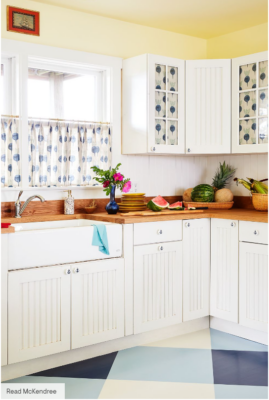
To open up this kitchen, designer Kevin Isbell painted an oversize glossy checkered print on the floor. The light, bright colors coordinate perfectly with the cafe curtain fabric.
6 FOREGO HARDWARE
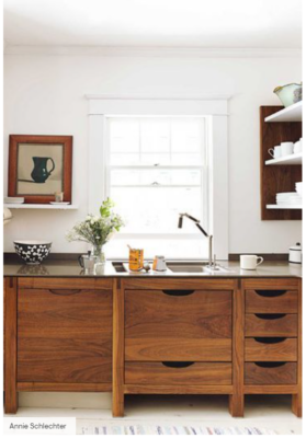
To maintain a visually sleek appearance, exchange exposed hardware in favor of inset grooves or cutout handles.
7 INSTALL A SET OF DOORS
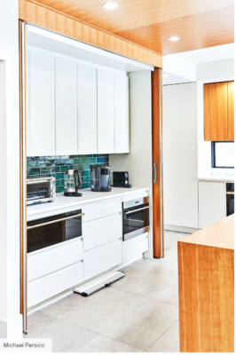
Take a note from designer Matthew Ferrarini, and install pocket doors to hide your kitchen’s hardest working wall when you’re not cooking or cleaning up. We love this idea for open floor plans and studio apartments.
8 COVER THE CLUTTER
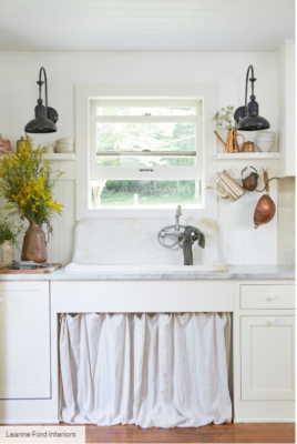
Have a farmhouse sink or exposed plumbing that has seen better days? Skirt the issue. That is, install a sink skirt hide the mess, the way they did in old English country kitchens.
9 UTILIZE YOUR ISLAND
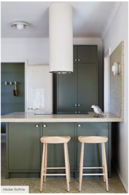
The hangout side of an island can absolutely work harder. Design it with cabinets instead of a solid slab of wood, and it’s ideal for storing not-so-frequently-used items.
10 CHOOSE A HAPPY COLOR
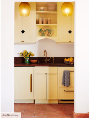
To make a narrow galley kitchen feel more intentional (and less like a dark alcove), install statement pendant lights. This ombré pair brightens it from end to end and draws eyes up.
11 CREATE AN APPLIANCE GARAGE
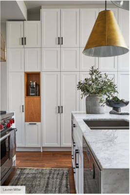
Don’t have much counter space? Consider adding an appliance garage within your cabinetry as designer Natalie Chong did in her former Toronto townhouse. The cubby held her Nespresso machine. Underneath, a push-to-open wood panel hid a Vitamix.
12 MAKE IT DOUBLE AS A MUDROOM
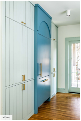
For a Georgia kitchen connected to a back door, designer Laura Jenkins turned some cabinets near the built-in refrigerator into a mudroom closet. The seamless construction also hides a coffee station and pantry, making the room feel larger.
13 MAINTAIN A NEUTRAL PALETTE
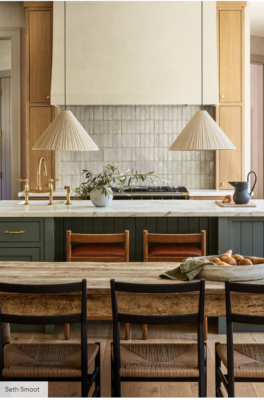
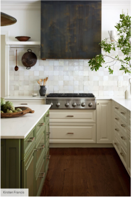
With a neutral-leaning color palette, your kitchen can feel more open and serene. Just take note of this tranquil kitchen by Lauren Nelson Design, which incorporates handmade tile, marble countertops, and cabinetry in Benjamin Moore’s Caldwell Green that subtly reference the outdoors.
14 BUILD IN KITCHEN NECESSITIES
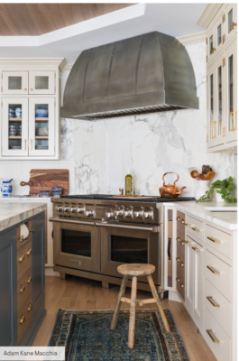
In this kitchen designed by Sarah Robertson, a slide-in cutting board and drying rack flank the range—making cooking a total breeze. Not to mention cleanup: You never have to worry about fitting them into other drawers or cabinets.
15 ADD A NOOK FOR BENCH SEATING
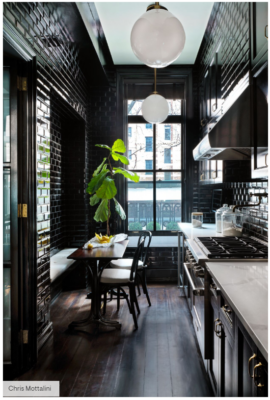
Consider maximizing your dining arrangement with a nook for a built-in bench as designer Nannette Brown did for this moody galley kitchen in a New York apartment.
16 OPT FOR A COUNTERSPLASH
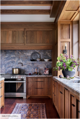
Countersplashes—when the same slab style is used for the countertop and backsplash—make everything look and function smoother. Pro designers are embracing the style, including designer Melanie Millner who chose Cielo quartzite for this European-inspired estate in Georgia. Enhance the spacious, cohesive feel with a little display shelf in the same material.
17 CLEAR THE COUNTERS
If hanging a pot rack from the ceiling isn’t ideal for you, opt for a short rail secured to a small open shelf. In this kitchen by designer Augusta Hoffman, a small rod displays a few go-to tools and cookware for easy access while cooking.
18 HIDE YOUR CHARGING STATION
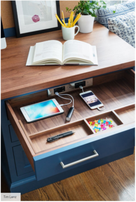
If you tend to charge your phone or iPad in your kitchen, move that clutter into a drawer with docking outlets like this sleek setup by designer Sarah Robertson. That way, you’ll have more counter space to cook and flip through recipe books.
19 USE FAUX BRICK
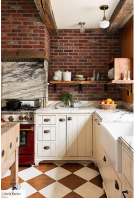
Amplify the character in your small kitchen with the look of exposed brick for less. In this San Francisco kitchen, designer Lynn Kloythanomsup chose a classic red brick, but since it was just for looks, went faux. “It’s like a thin brick tile,” she explains.
20 WORK WITH SMALLER APPLIANCES
Save counter space with a built-in electric cooktop. A slim version—like this one with two burners in a working pantry by Rob Klein and Amy Kreutz of Conceptual Kitchens & Millwork—will give you more room to unload groceries and prepare meals.
21 ADD SLEEK OPEN SHELVING
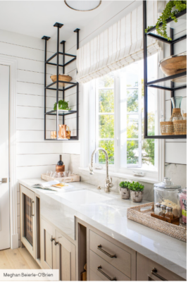
Create more storage and decor space with industrial-style open shelving in small columns, as designer Caren Rideau did in this kitchen. It’ll clear off the counters and let you easily see your inventory.
22 USE A PULL-OUT SYSTEM FOR BOTTLES
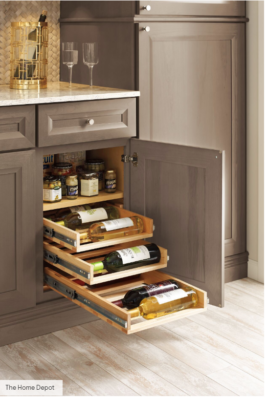
Anyone who loves wine but doesn’t have the space or budget for a mini wine fridge needs this pull-out system from Thomasville Cabinetry, which is available at The Home Depot. The best part? You can use it for other drinks, like water and cans, should you not always have a full wine selection on hand.
23 HANG FROM THE CEILING
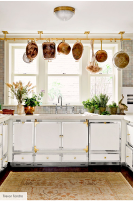
If you’re low on cupboard space, add storage with rods secured to the ceiling, as designers Carey Maloney and Hermes Mallea did here. Copper-pipe shelving or a brass rod look super chic and are ideal for hanging mugs or ledges to stack dishes.
24 USE YOUR GREEN THUMB
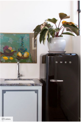
Plants make everything feel happier—even small kitchens. Plus, if you get great light, why not make use of it? ETC.etera cleverly put a large plant on top of the fridge to brighten up the space.
25 ADD TASK LIGHTING
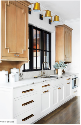
You need all the light you can get in a small kitchen. Here, designer Corey Damen Jenkins installed sconces over the countertop and sink area. Not only do they literally brighten the workspace, but they also add some shiny style.
26 GET SOME STATEMENT LIGHTING
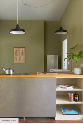
Is anyone actually going to notice how big or small your kitchen is when there’s an eye-catching pendant (or two) overhead? Definitely not. We’re also loving the mixed metals and olive green paint.
27 ADD A SKIRT
No closed cabinets under the kitchen sink, but plenty of unsightly things you need to tuck away? Don’t worry. You can hide items like wastebaskets and cleaning supplies by concealing them with a fabric skirt as Scott Meacham Wood did here.
28 MAKE A BREAKFAST BAR
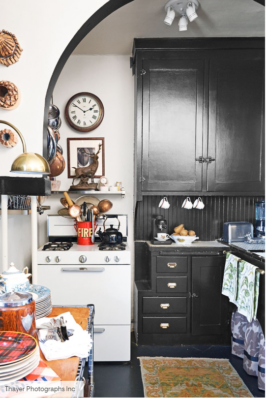
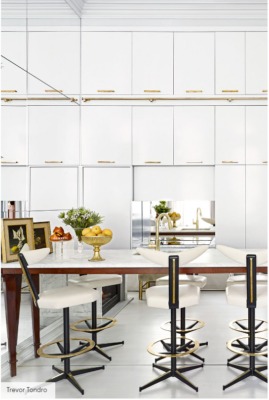
You might not have room for a breakfast nook, but you can probably make some space for a counter bar, especially if you place it strategically. This one in a glam kitchen designed by Amir Khamnejpur scores double points: It’s a counter-height dining table that moonlights as a kitchen island.
29 WARM IT UP WITH A RUG
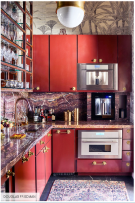
When there’s not much you can do to a cramped space without making it feel even smaller, add a rug. It’ll warm up the room and add color and pattern without overwhelming your kitchen. Interior designer Michelle Nussbaumer also packs plenty of texture-rich materials into the small space.
30 CHANNEL A SHIP
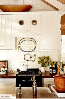
The smaller, the cozier. Embrace it with cream colors and gold fixtures. In this small cubic kitchen, the retro ship-inspired hardware and design details complement the size of the space.
31 OPT FOR GLASS DOORS
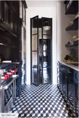
In this kitchen by Balsamo Antiques and Interior Design, tall interior glass doors create the illusion of a much bigger space, and the black lacquer paint is a testament to embracing darker, cozier spaces instead of forcing them to look big and bright with all-white interiors. Though modern in many ways, the open shelves display antiques from the occupant’s travels for a timeless look.
32 PARE DOWN
Do you really need 25 extra bowls? Pare down your kitchen stuff to the bare minimum, and you’ll be surprised how much space you actually have. That way, your textural materials can really pop.
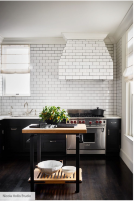
33 KEEP IT CLASSIC
Here’s one more reason to love subway tiling, brought to us by Nicole Hollis Studio. Lay them horizontally to cover every last inch of space, from the backsplash to the ventilation hood, to help the space feel wider. And stick to a neutral, monochromatic palette for a classic touch.
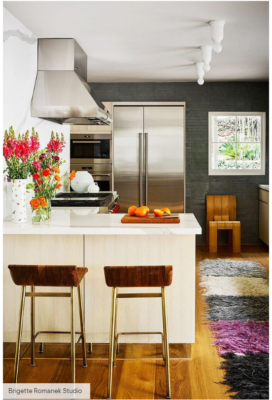
34 ADD A RUNNER
Fun, colorful runners were practically made for long and narrow galley kitchens. In this one by Romanek Design Studio, the mix of materials, like the white marble backsplash and the matte black tiles, create a cool, unexpected contrast.
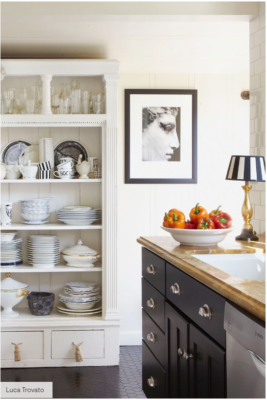
35 REPURPOSE FURNITURE FOR STORAGE
When you run out of cabinet space, just repurpose a dresser or armoire to house all of your plates, glasses, and serveware. Francophile Stephen Schubel gave his modest California cottage the royal treatment with antique gilded pieces and an Edwardian plaster cabinet.
36 GO HIGH-GLOSS
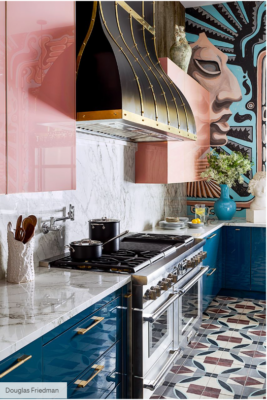
Here’s another show-stopper brought to you by Michelle Nussbaumer. The blush pink and deep aqua lacquered cabinets are reflective, which means they make the space feel larger—like the classic mirror trick, but colorful.
37 CREATE A PULL-OUT PANTRY
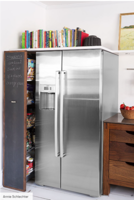
If you’re adding shelves for storage, you don’t want them to look cluttered. Enter this pull-out pantry, which makes use of an awkward nook next to the refrigerator and hides unsightly dry goods behind a super-useful chalkboard door.
38 PAINT THE CEILING
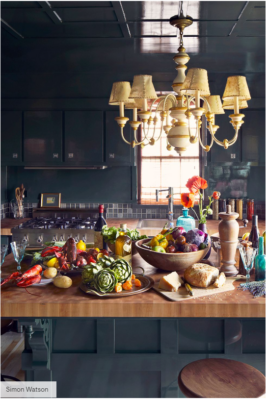
When using high-gloss paint for a reflective, mirrored effect, don’t forget to include your ceilings. In this small kitchen designed by Kristin Hein and Philip Cozzi, the sleek finish is balanced with English country–style warmth courtesy of rustic wood accents and a whimsical light fixture.
39 MIRROR THE WALLS
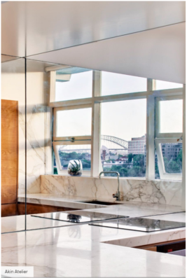
Mirror the walls to make a small kitchen feel larger. In this gorgeous apartment designed by Akin Atelier, the mirrors accentuate the sweeping views. And with a view like that, who cares what size the kitchen is?
40 BUILT IN WINE STORAGE
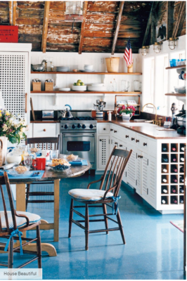
Sneak in extra storage every chance you get. Here, Gary McBournie nestled an entire wine storage cabinet within the millwork of his kitchen—no extra floor space required.
https://www.housebeautiful.com/room-decorating/kitchens/g394/small-kitchens/
